Help me Angela exists to help people feel safer in the moments that matter most. Built for modern life, the app connects people with a trusted network of support so they can feel more confident when they are alone. The challenge was creating a brand that could speak to personal safety without amplifying fear, especially for a young female audience who live with that concern every day.
Personal safety is deeply emotional. Almost everyone has a story of a moment when they felt afraid or unsafe. Help me Angela needed a brand that acknowledged that reality, but did not dwell on it. One that felt supportive, aspirational and human. A brand that made people feel protected, not reminded of what could go wrong.
We worked with the Help me Angela team from the very beginning, building the brand alongside the product itself. To tell the story properly, we started by listening. We spoke to over 100 people across 29 countries and heard experiences that were difficult, personal and often shared quietly. What stood out was not just how common these moments were, but how much feeling safe changed how people lived their lives.
Across late-night workers, business travellers, international students and people of different ages and backgrounds, the patterns were consistent. Feeling unsafe was easy to remember. Feeling supported was rare. And when people did feel safe, they felt freer, more confident and more alive.
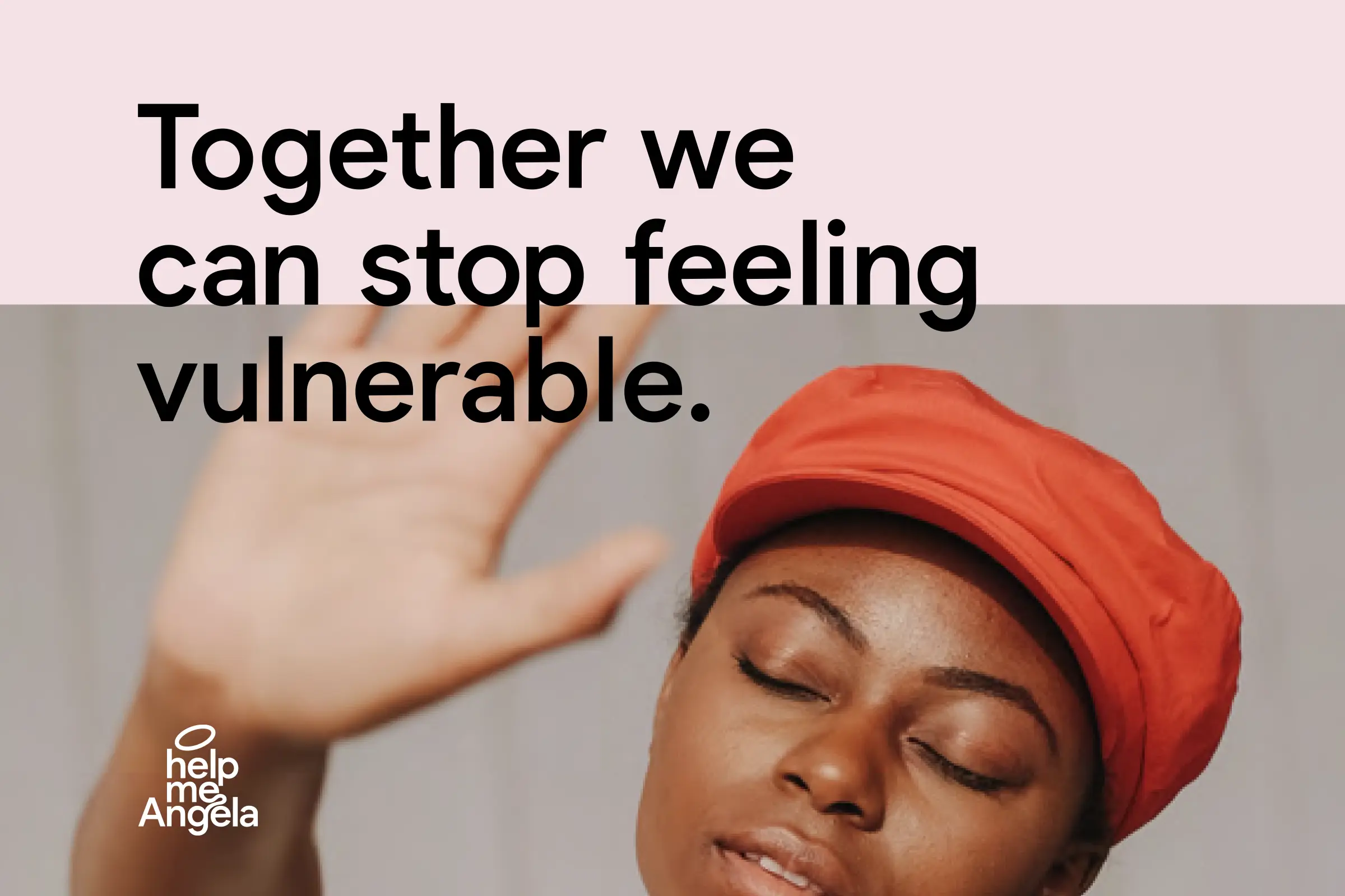
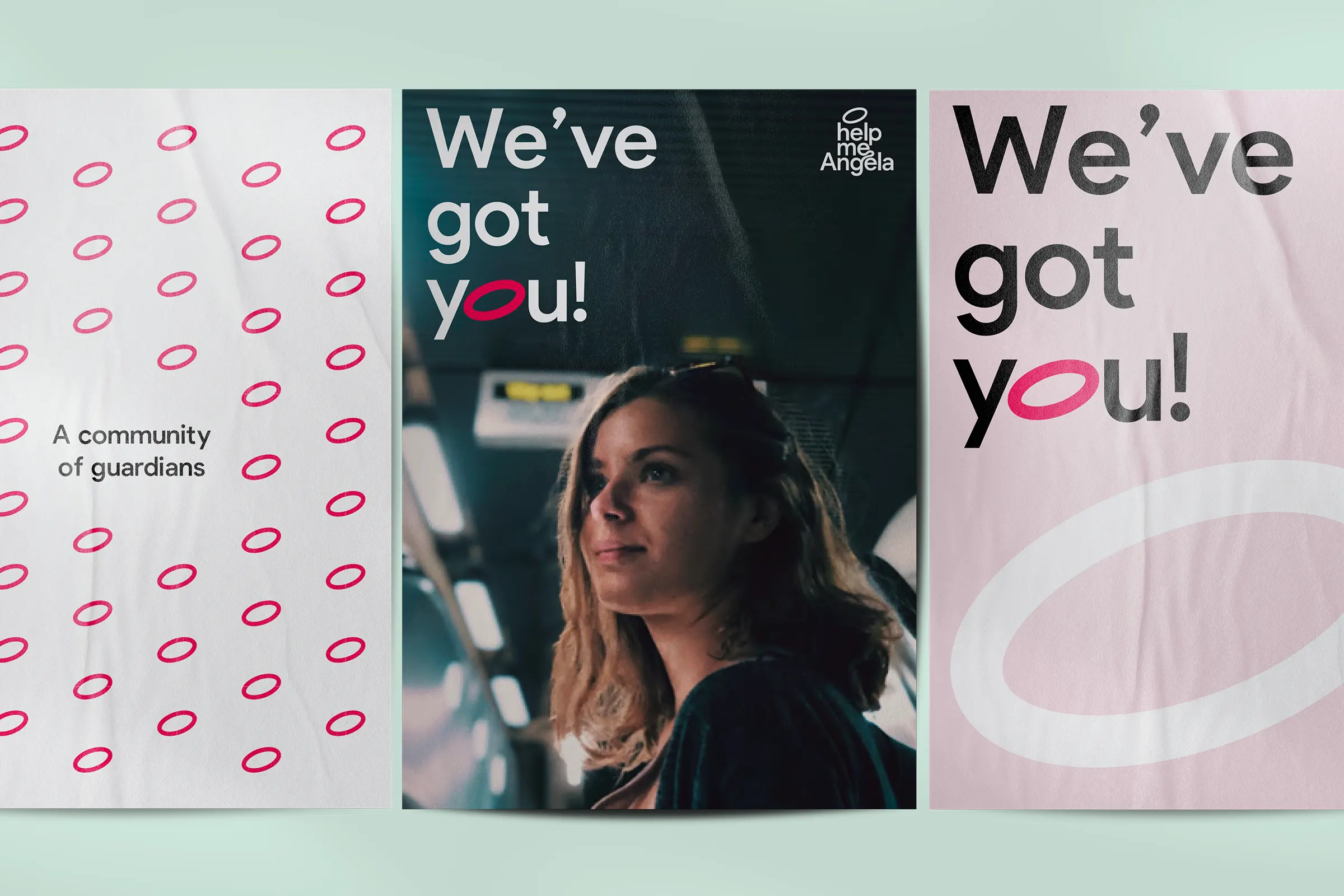
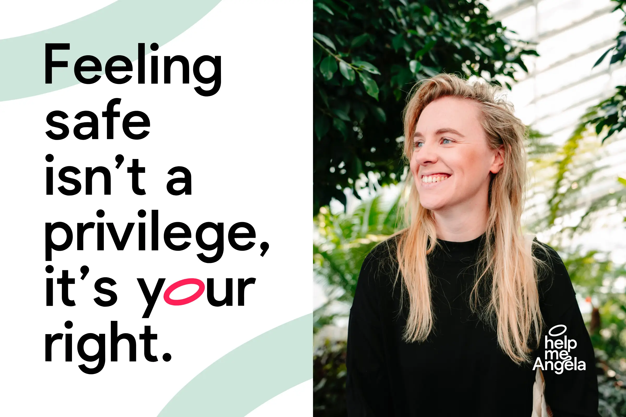
This insight shaped everything that followed. Help me Angela should not be a warning system. It should be a presence. A guardian angel in your pocket. We built a brand story that focuses on reassurance and collective care, using language that empowers rather than alarms. The message was simple and human. You are not alone. We have got you.
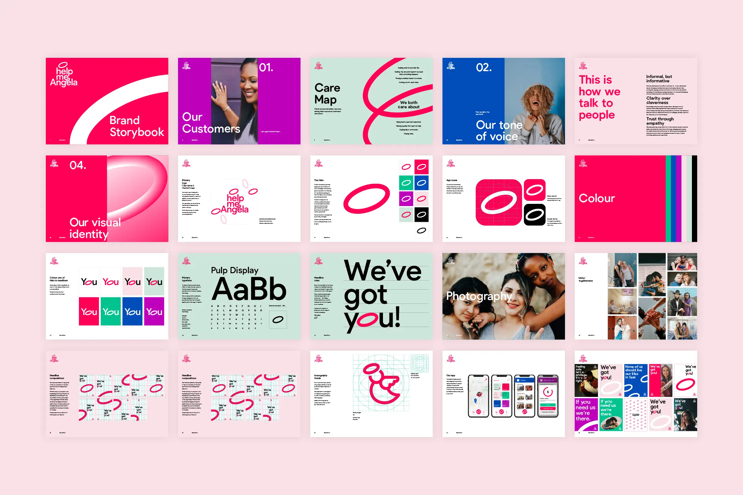
The visual identity brought this feeling to life. At the centre is the halo, a symbol of protection, unity and calm. It represents both a guardian angel and a ring of safety, surrounding and supporting the individual. Alongside this, we developed a clear and inclusive icon system designed to be understood across cultures and languages, reinforcing accessibility and trust.
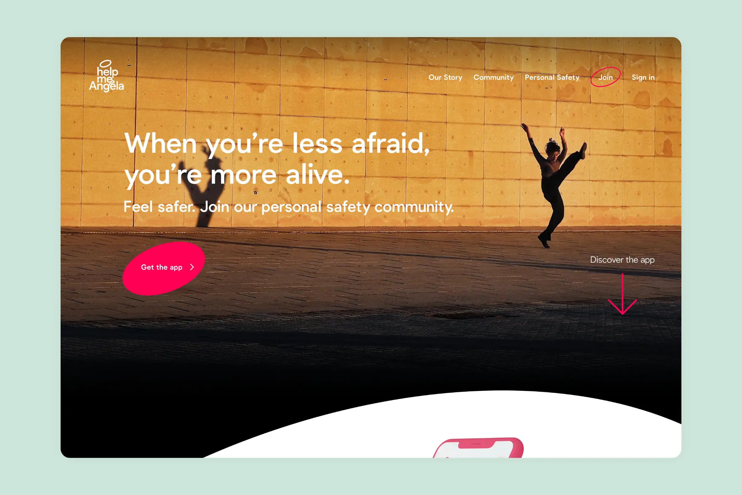
The primary outputs were brand positioning, brand stories and a full visual identity system, all brought together in comprehensive brand guidelines. Following launch, we continued to support Help me Angela across their website, brand film and organic social content, helping translate the brand into real-world touchpoints. The result was increased engagement and visibility, but more importantly, a brand that makes people feel supported.
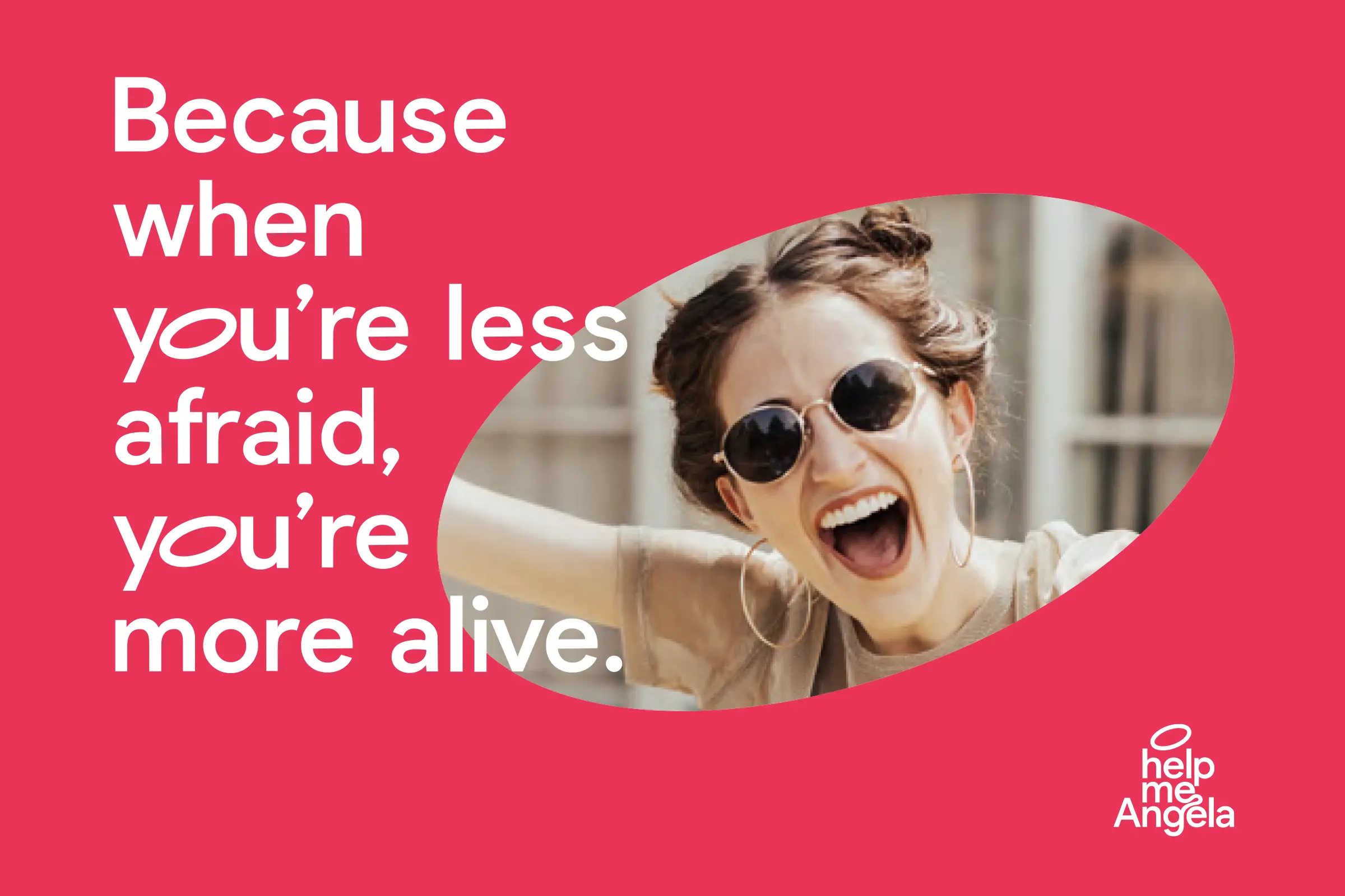
Help me Angela became a brand built on care, confidence and community. One that helps people feel less afraid, and more alive.
